|
inspiredwebpresence HERE TO HELP YOU BUILD A WEB BUSINESS - NOT JUST A WEBSITE! |
|
|
|
|
inspiredwebpresence |
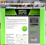
My Portfolio I invite you to go take a look at the websites described below. Each site is very different from the others. And, the design I create for you will be different, as well. Each design is custom and unique, taking into consideration the client's individual corporate image. I work with my clients to come up with a design that they are happy with. Like this one... This was a brand new business, when the owner came to me. The foundation for the storage facility wasn't even in yet, when I started building the site. We built in some handy features into the site, which make it easy for their customers to reserve storage units, and make rental payments, all online. We also built a mobile version of the site, for those customers who search for businesses on their smart phones. Being mobile-friendly also gets you 'brownie points' from Google these days. ;) We added some good on-site optimization for the search engines, and achieved first page positioning on the search engines.
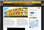
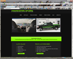
This site is a 'spin off' site from another one I did for the client, Action Glass. They wanted to create more business for their Auto Glass Dept, so I recommended building a separate site for it. The new auto glass site is already enjoying first page placement on Google, Yahoo and Bing! The owner and the dept manager are both happy to have the phones ringing again. =o)
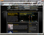
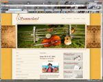
The client wanted a design that was 'tougher' than their old one, since they're in an industrial industry. They love the new look, and so do I! Here's one I did a few years ago... The Summerland Bluegrass Group needed a new design for their website. This one is bright and warm... just like Summerland!... and the Group says they're loving this new look, and the blog that I included on it, 'cuz now they can interact with their site visitors - bluegrass fans and musicians alike!
This was a new company to Kelowna, and they needed a web presence. They wanted something contemporary, sharp
with bright green. I believe we accomplished that! Here's a landscaping company...
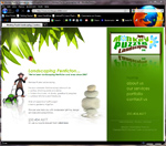
The site reflects the owner's fun-yet-professional image and personality. The site is finished, although it will grow over time with the on-going addition of photos of projects, and adding new pages. The client wants to generate business from the Internet... to help him compete successfully with his competitors who are already online...so I did some search engine optimization on his site, and within three weeks, his site was on the 1st page of Google for several of his best keywords, and even a few #1 positions! Over time, as the site ages and we add new content, photos and pages, the site will continue to do better and better in the search engines. If we were to implement more marketing strategies, I could have this business dominating the first page of the search engines. ;o) UPDATE: This landscaping biz has new owners, and we are doing some updating on the site. It will be be back online soon. This was a fun one to do...
I did a little search engine optimization and now they have several #1 positions on Google and Yahoo! This is another business that would be perfect for Social Media Marketing.
And, here's one we just totally rebuilt recently..
The company actually offers a number of different services, and the old site made it hard to figure out what was what. So, I compartmentalized everything into three separate areas of service. Now, it's easy for site visitors to zero in on exactly what they're looking for. The main design challenge was the company colours... blue and red on bright yellow. A combination that can make it hard to get a classy look. But, we did it. One of the owners had an idea of the look and feel he wanted for the site, so I took that idea and turned it into a design that is totally unique. Since the company is all about glass, I put in some tall, glass buildings for a background, and gave the page a look of glass on glass. I did some onsite and offsite search engine optimization and got the site listed on the first page of Google for a number of their best keywords. Our efforts have driven more Internet traffic to their website than their YellowPages.ca listing... I mean, not just a little more...I mean, a TON more! We're starting to implement several Internet marketing strategies, which include social media, a YouTube video channel, reputation marketing, and more . It will be exciting to see this already-successful business, take an even bigger share of their market... while cutting the company's advertising costs in half! Gotta love a plan like that. Now for something different...
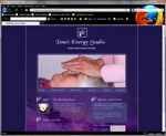
The project included some basic Internet marketing. I did some onsite and offisite stuff, and her site has been performing very well in the search engines... several #1 placements! Not just page one... but the #1 position on page one. =o) Her type of business is perfect for social media marketing. Hmmm. We may need to schedule a chat soon. ;o)
Here's a really cute one...
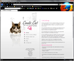
We recently did some SEO on the site, and we've got it onto the first page of Google. With a little more on-ste and several off-site techniques, we could get it closer to the top of the page. ______________________________________ Come on back for a visit again real soon! | |
SiteMenu  |
|
 |
|
SiteSearch  |
|
 |
|
|
|
COPYRIGHT ©
Inspired
Web Presence. All rights reserved.
